Witty Typography: The Secret Sauce for Fun Designs
Share
Frequently Asked Questions
1. What is the role of typography in design?
2. How does font choice affect humor in designs?
3. Why is hierarchy important in typography?
4. What is the significance of spacing in typography?
5. How can color impact typography and humor?
Typography plays a pivotal role in design, significantly influencing both functionality and aesthetics. The choice of typography can evoke emotions, create a mood, and even communicate personality. This blog post explores the essence of typography in making designs witty, particularly in the realm of Funny T-Shirts. At MostlyHuman, a family-owned and operated business in the USA, we're dedicated to delivering top-quality products while providing personalized customer care—because every order matters to us.
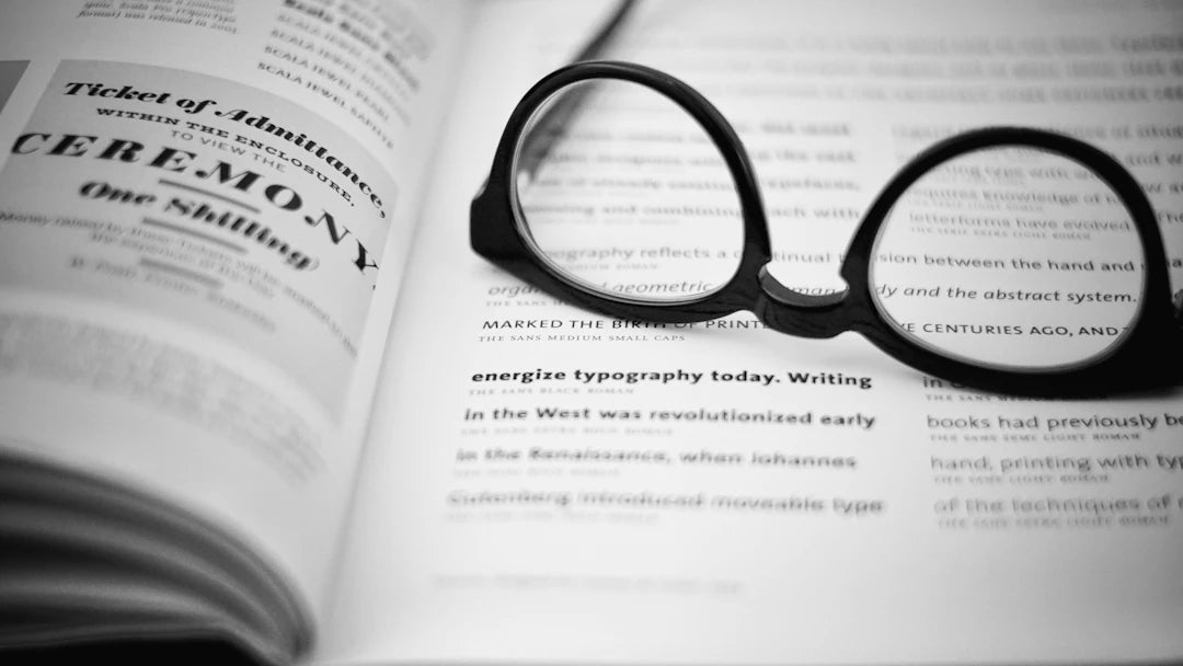
The Essence of Typography
Typography encompasses the style, arrangement, and appearance of text. It serves as a visual representation of communication. In design, whether for websites, packaging, or apparel, the typography sets the stage for how the message is conveyed. When it comes to witty designs, well-chosen typography can turn a simple phrase into a hilarious statement.
The Impact of Font Choice
Font choice can make or break the humor in your design. A quirky font can add an element of fun, while a standard font might render the message dull. Take, for instance, the phrase on a Socrates shirt. If you choose an elegant serif font, it might come off as pretentious; however, using a bold, playful font could infuse a sense of irony and humor.
- Serif Fonts: Often associated with tradition and formality.
- Sans-Serif Fonts: These are modern and clean, often conveying a casual vibe.
- Script Fonts: They can add a personal touch but may lack readability in certain contexts.
The key is to choose a font that aligns with your message and adds a layer of wit. At MostlyHuman, we take care to select the right typography for our Funny T-Shirts, ensuring that each design resonates with humor and personality.
Hierarchy and Emphasis
Hierarchy refers to the arrangement of text to guide the viewer's eye across the design. A well-thought-out hierarchy not only improves readability but also enhances the overall aesthetic. In funny designs, hierarchy can be used to emphasize the punchline of a joke or a witty remark.
Creating Visual Interest
To keep the viewer engaged, vary the size, weight, and color of your typography. For example, you could use a large, bold font for the initial attention-grabbing phrase on a shirt and pair it with a smaller, lighter font for a clever follow-up. This not only creates a visual rhythm but also keeps the humor fresh.
- Size Variation: Use larger fonts to capture attention and smaller ones to provide supporting details.
- Weight Variation: Bold text can highlight key phrases, while lighter weights can soften a message.
- Color Use: Different colors can evoke emotions and highlight important components of your design.
At MostlyHuman, we utilize these techniques to ensure our Socrates shirt and other designs not only deliver humor but also have dynamic visual layouts that capture attention.
Spacing: The Unsung Hero of Typography
Spacing, or white space, often goes unnoticed, yet it plays a vital role in typography. Proper spacing ensures clarity and helps separate elements that might otherwise compete for attention. In humorous designs, this can be crucial to ensure the punchline lands effectively.
Line and Letter Spacing
Adjusting line spacing can affect readability and flow. For example, if the lines of text are too close together, they may come off as cluttered, diminishing the impact of your humorous message. Similarly, letter spacing can also affect how a clever phrase is perceived. Too much space can make the message feel disconnected, while too little can create confusion.
- Line Spacing: Ensure lines of text have enough space to breathe, especially in multi-line designs.
- Letter Spacing: Consider adding space around particularly witty phrases to give them room to shine.
The Psychology of Typography in Humor
Understanding the psychology behind typography can unlock the potential for creating designs that evoke laughter. Fonts are not merely letters; they convey attitudes and feelings. For instance, a cursive font may evoke a feeling of whimsy, while a bold font could communicate strength or confidence.
Evoking Emotion Through Font Style
Diving deeper, researchers have shown that typeface can even affect a person's perception of the content. For example, a playful font is more likely to elicit a light-hearted response, making it ideal for humor-oriented designs such as our Funny T-Shirts.
Similarly, when creating a Socrates shirt, one might choose a font style that reflects Socratic wisdom in a humorous context. This juxtaposition can create a delightful contrast that enhances the overall wit of the design.
Color and Typography: A Dynamic Duo
Color selection is equally vital in typography. Colors can change the tone of a message and affect how humor is perceived. The connotations associated with different colors—like red for excitement or blue for calm—can work in tandem with typography to enhance the funny aspect of your designs.
Choosing the Right Color Palette
For a successful marriage between typography and color, consider a color palette that complements both the font and the message. Here are some tips for choosing the right colors:
- Contrast: Ensure there is sufficient contrast between the text and the background for legibility.
- Fun Colors: Bright and vibrant colors often enhance humor, making designs more attractive.
- Emotional Touch: Use color psychology to evoke specific emotions that align with the humor.
At MostlyHuman, we understand the significance of these choices, ensuring our Funny T-Shirts use color and typography effectively to convey just the right amount of wit.
The Intersection of Typography and Pop Culture
Incorporating elements of pop culture into typography can resonate with audiences and enhance the humor of your designs. Using trendy phrases, slang, or references from popular media can capture attention while cleverly employing typography to create a witty statement.
Staying Current with Trends
To remain relevant, it’s vital to stay updated with emerging typography trends. In recent years, we’ve seen a resurgence of retro fonts, playful typefaces, and minimalistic designs. At MostlyHuman, we embrace these trends while ensuring that our designs, including the cherished Socrates shirt, remain timelessly funny.
Engaging Your Audience with Humor
Ultimately, creating designs that are funny and engaging requires a deep understanding of your audience. Know what makes them laugh, and tailor your typography choices accordingly. This understanding fosters a sense of connection, turning a simple shirt into a conversation starter.
The Power of Storytelling through Typography
Consider why certain jokes resonate more than others. Often, the delivery and context play significant roles in their effectiveness. Typography can enhance storytelling by creating a recognizable visual narrative. Use typography to build a connection, ensuring your humor is relatable and enjoyable.
Conclusion: Unlocking the Wit in Typography
Typography is not just about selecting fonts; it’s about harnessing the power of text to evoke laughter and emotion. A well-designed Socrates shirt or Funny T-Shirt relies on careful consideration of font choice, hierarchy, spacing, and color. At MostlyHuman, we pride ourselves on our commitment to delivering top-quality products while providing the personalized customer care that makes every order significant. Embrace typography as a powerful tool in your design arsenal, and watch as your creations bring joy and wit to the world.
Explore the world of another Shopify or Wix store owner. Visit their captivating online store. Keep in mind that this is a promotional link, and we are not responsible for the content of the linked store.