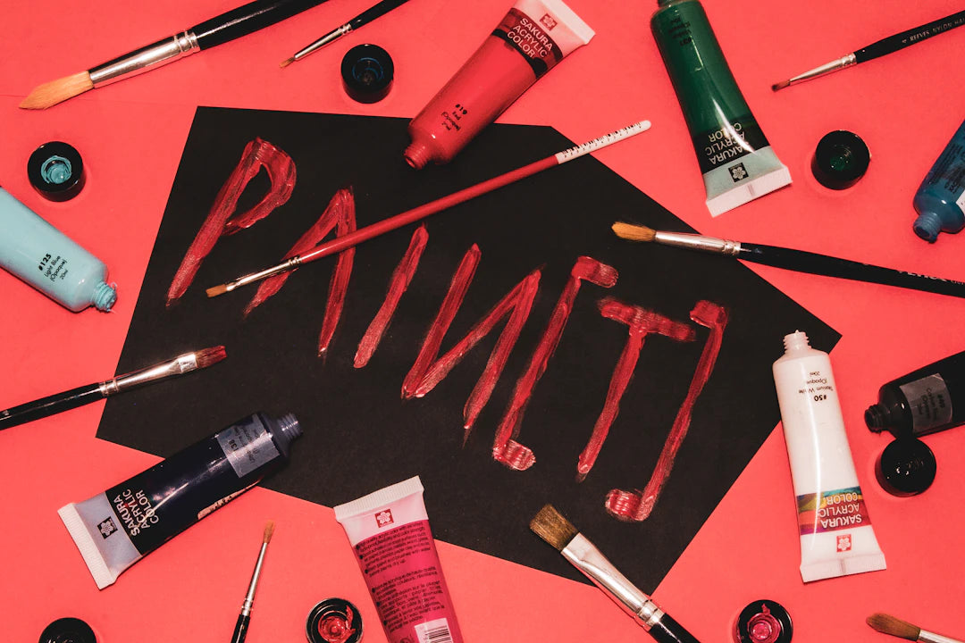
The Typography Behind Laughs in Funny Merchandise
Share
Frequently Asked Questions
1. What is the significance of typography in humorous merchandise?
2. How does font choice impact the design of funny t-shirts?
3. Why is spacing and alignment important in typography?
4. What role does color play in typography for humorous merchandise?
5. What is the 'less is more' rule in typography for humorous designs?
When it comes to humorous merchandise, the significance of typography cannot be overstated. The way text is presented on a product can evoke laughter, emotional connection, and even spark conversations. Typography is not just about font choice; it encompasses style, size, spacing, and much more. At MostlyHuman, a family-owned and operated business in the USA, we understand the powerful impact of typography in designing funny t-shirts that resonate with our customers. We are dedicated to delivering top-quality products with personalized customer care because every order matters to us.
The Essence of Typography in Merchandise Design
Typography is an art form that transcends mere text. The right choice can elevate a design concept and create a sense of brand identity. Particularly in the realm of funny t-shirts, typography plays a critical role in enhancing the whimsical nature of the humor being conveyed. Whether it's a witty phrase, a pun, or a playful commentary, the way these words are portrayed can significantly influence how effortlessly they connect with the audience.
The Role of Font Choice
The first step to effective typography is selecting the right font. The font choice impacts readability, tone, and overall aesthetics. For instance, a bold and playful font may suit a humorous slogan perfectly, drawing immediate attention, while a more script-like typeface could invoke a sense of whimsy or nostalgia.
- Bold Fonts: Great for making loud statements and capturing attention.
- Script Fonts: Best for evoking a softer, more emotional appeal.
- Sans-serif Fonts: Clean and modern, ideal for straightforward humor.
At MostlyHuman, we believe that our choice of font should resonate with the spirit of the message you want to convey. It’s about connecting on a deeper level with our audience and ensuring that the humor is not only seen but fully enjoyed.
Size Matters
The size of the typeface can dramatically influence the visual hierarchy of a design. Larger text draws immediate attention, whereas smaller text can be used to complement the main message. An amusing tagline may utilize larger fonts to dominate the shirt, while smaller fonts could add additional context or a secret punchline beneath the main phrase.
Spacing and Alignment: An Underestimated Element
Many designers overlook spacing and alignment, yet these factors can significantly affect how the message is perceived. Well-spaced letters and words create a clean look that makes the humor stand out. On the other hand, cramped letters can give off a chaotic vibe, which may not align with the intention of the piece.
Creating Balance
Finding balance in typography involves ensuring that both the main and secondary elements complement each other. For example, if a large, bold font is used for the primary joke, the supporting tagline should be smaller, yet still readable. This approach not only enforces a hierarchy but also leads the viewer's eye in a natural way.
- Top Alignment: Creates a traditional, professional feel.
- Center Alignment: Gives a more casual, relaxed ambiance.
- Bottom Alignment: Allows for surprising reveals in single designs.
The Emotional Influence of Typography
The world of funny t-shirts is primarily about making people laugh; however, typography breathes life into that humor. The right type can evoke a feeling of joy, surprise, or nostalgia, enhancing the overall effectiveness of the humor. When choosing typography for humorous merchandise, it’s essential to consider the emotions associated with specific fonts and layouts.
Creating Connection
Typography is not merely a design element; it’s a bridge to human connection. The playful and lighthearted nature of funny text can nurture relationships, promote laughter, and even break the ice among strangers. A well-executed typographic approach can trigger an instant smile or the sound of laughter, which is the ultimate goal for any humorous merchandise.
At MostlyHuman, we strive to optimize this emotional connection through our designs. Each shirt has been carefully crafted to ensure that the typography aligns not just with the humor, but with the personality of our audience.
Consider Your Audience
Understanding your target market is crucial when working on typography for humorous merchandise. What appeals to younger audiences may not resonate with older generations. Keeping this in mind can help inform font choices, sizes, and layouts that will attract the desired demographic.
The Power of Trends
Just as fashion trends evolve, so do typography trends in merchandise design. Popular culture, internet memes, and societal movements all play a role in shaping what is deemed humorous at any given time. Staying ahead of trends can provide an edge, ensuring your designs remain fresh and relevant.
The Final Touch: Color and Typography
Color works hand-in-hand with typography to amplify the emotional impact of humorous designs. The way color interacts with text can highlight humor and steer attention toward the message. Bright colors often evoke feelings of happiness and playfulness, while muted tones may provide a laid-back vibe.
Harmonizing Colors and Typography
Choosing pairs of colors that complement rather than clash with the typography is essential. A vibrant red or yellow can energize a bold font, while softer pastels may lend a gentle touch to more whimsical designs. At MostlyHuman, we carefully select color palettes that work in harmony with our typography choices, creating pieces that are not just funny but visually appealing.
The Golden Rule: Less is More
With humorous merchandise, it’s easy to overdo it; however, simplicity often proves to be most effective. Cluttering a design with excessive font types or effects can dilute the humor conveyed. Thus, sticking to one or two typography styles can ensure that the message remains clear and impactful.
The Art of Whitespace
Whitespace can be a powerful tool in typography. It provides breathing room, allowing the viewer to focus on the humor without distractions. Proper use of whitespace can enhance comprehension and offer a sharper, cleaner design that makes the text pop.
Crafting Memorable Merchandise
Creating memorable funny t-shirts rests heavily on effective typography. By leveraging font choice, size, spacing, and color, we can bring humor to life in a way that delights customers and invites laughter. At MostlyHuman, we pride ourselves on providing family-centered customer care and goods that resonate with a sense of humor. We aim to craft products that not only showcase great design but also emphasize emotion and connection.
Transforming Ideas into Laughter
Ultimately, the impact of typography in humorous merchandise is profound. Thoughtfully designed typography can engage emotions, create connections, and amplify the humorous intent behind each slogan. In the world of funny t-shirts, this art form plays an essential role, turning simple phrases into genuine laughter and memorable moments.
At MostlyHuman, we’re proud to incorporate the best practices in typography to ensure that our humorous merchandise speaks volumes. Our commitment to top-quality products and personalized customer care is unwavering. We want every customer to feel valued and appreciated, turning each order into a joyous experience. Together, let’s explore the laughter through typography and discover its unparalleled impact on funny merchandise!